- Strategy
- Visual and Design Guide
Strong design and visuals are imperative when communicating with older adults and their families. Leverage design, real-life images, and other graphics in your communications materials to capture the viewer’s attention and maximize impact.
Graphic Guidance
Images and videos are powerful. The use of photos, graphics, and videos is an effective tool to enhance your communications and the public’s understanding of the sector.

Exclude ageist or stereotypical photos or images. Harmful stereotypes can include classic tropes of ageism like canes, buns, gray hair, and other caricatures of older adults. You should also avoid using unrealistically positive images of older people—not all of us are skydiving and doing yoga on the top of a mountain.
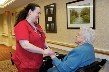
Choose authentic images that capture the viewers’ attention. Use images showing people engaged in activity with one another—using photos of your own community as often as possible. Do not rely on stock images that are too staged or steeped in sadness, frailty, or inactivity.
Depict engagement and independence. Show older adults in action, enjoying life, and being engaged with the world around them. Don’t mislead or avoid reality, but favor images that capture moments of connection, contribution, and self-determination.
Reflect the breadth of older adults in this country. Make sure the viewer sees themself or someone they know represented in images. Include meaningful diversity of age, race, ability, behavior, and culture.


Showcase your care professionals. Your direct care staff are among your best assets, so include them in videos and photos. Capture their moments of compassion, dedication, and professionalism.
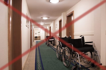
Feature people and emotions whenever possible. Include older adults, family members, and caregiving professionals in images that capture their compassion, caring, joy, and happiness. Avoid eliciting coldness or isolation with images of buildings, empty rooms, or parts of the body like hands, without context.
Use high-quality, high-contrast images. Steer clear from dull, low-resolution, abstract, or difficult to discern images; and adjust contrast and color brightness to make images pop—but don’t sacrifice authenticity for a polished image.
Keep videos short and attention grabbing. Aim to produce videos between 30 seconds and 2 minutes. Most viewers will become captivated (or not!) within the first 5 seconds of your video. So get to the point quickly.

Examples to use:


Examples to avoid:


Typographic Guidance
Everything about your design approach communicates something to your audience. Use text and layouts to reinforce the principles of Opening Doors to Aging Services.
Choose highly readable fonts and typefaces. Avoid ornate and complex typefaces, as unnecessary flourishes can be hard to read. Choose a mainstream font that will feel familiar to your users.
Make the type large enough for older adults to read easily. Minimum font size should be 12pt or 16pt. The best way to know whether your type is large enough is to get feedback from your intended readers.
Use upper and lower case letters in combination—avoid all caps when possible. Text in all capital letters is hard to read, so default to using capital letters only at the beginning of sentences and other places where they are required.
Example to use:

Example to avoid:

Use boldface type for emphasis—avoid italics. Minimize underlining for emphasis, using it only for linked text in digital formats.
Maximize space between lines of type. Use a line height (leading) that is 130% to 150% larger than the font size.
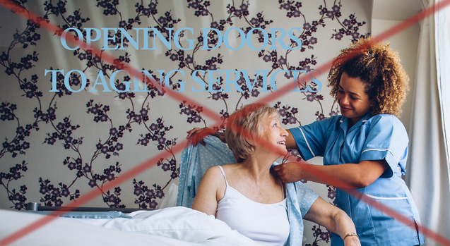
Maximize contrast with dark text on simple, light backgrounds. Dark text on a white or very light background is the easiest to read: stick to black or deep, bright colors. Use dark backgrounds with light text (reverse text) sparingly. Avoid placing text on shaded or patterned backgrounds that can interfere with ease of reading. Avoid overlaying images with other images or text.
Example to use:

Example to avoid:

Create a clean, uncluttered layout that has plenty of white space. Use white space to break up information and leave space between sections and around images.
Back to The Strategy.